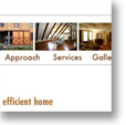
 David Ryan came to us for a simple brochure site with a lot of pictures and architectural drawings that he wanted to display. We wanted his site to reflect the kind of elegant architectural design Ryan does himself, so we created a simple page template to show off the photos. The header features a row of images (which can be updated as new images come in) as a visual reminder that this is an architect’s site. The Galleries are where Ryan can really show off his work, with a master menu of all the galleries, and image-driven navigation on the sidebar for each gallery. The graphic navigation helps keep users oriented so they don’t get lost in all the photos.
