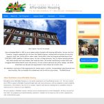
The Brattleboro Affordable Housing group had a very old static site that had served them reasonably well for over a decade when they suddenly realized that everyone was surfing the web on their phones. It was time for an update. The old site was designed to the standards of the late 90s and looked it. […]
Rural Hospital Updates for Mobile Era
Grace Cottage Hospital needed work on their aging web site to bring it up to date with current standards and provide site visitors with a useful interface to the hospital’s many services. Working closely with staff, we created a new theme and worked with them to update their content. A dynamic home page features rotating […]
Non-Profit Mobilizes For Future Action Without Losing Past Content
NWTRCC had an old HTML and PHP-based web site with lots of legacy content that needed to be converted to WordPress and made mobile accessible. Building them an accessible, mobile-friendly web site was only half the battle. The other half was bringing in hundreds of pages of old content and formatting it for the new […]
Humane Society Gets Double Facelift
Our local humane society called us one week in a panic — their web site had gone down and the web developer was nowhere to be found. Could we give them a new web site by Monday? Yes, we could and did. They were back online with a new site within three days, quite a […]
Mobile-ized Catering Site
Our client needed a new mobile-friendly web site for her catering business, and since we had built her old site, she called us. We knew she needed the update but she liked the look and feel of her old site, including the “placemat” border that surrounds the page. Fortunately, we were able to duplicate the […]
Private College Gets Reorganization and Facelift
Beacon College wanted a remake of their recent vintage web site to organize their site content and give them a more dynamic presentation. The new site needed to be mobile friendly, ADA compliant, and easier for users to navigate. Working in close consultation with college staff, MuseArts designed a new WordPress theme that met their […]
Elegant Mobile Theme For Highly-Rated Restaurant
For Peter Havens Restaurant, the new site had to reflect the elegance and quality of the establishment for both their long-time clientele as well as new customers. We went with a clean, simple layout in a classic palette of black and white with a deep red as the accent color. The layout provides easy access […]
Online Memberships for Snowmobile Club
This Vermont snowmobile club needed to provide its members with a way to buy and renew trail memberships online. Since the forms were complex — GMTB needs to know about each and every sled registered — a simple contact form wouldn’t do. We set them up with a mobile-friendly WordPress site with the a streamlined […]